


Apple’s iOS 26.5 release candidate, dated May 04, 2026, confirms the arrival of 11 distinct Pride-themed wallpapers—plus a new user-customizable option—just ahead of its official launch.
Key Takeaways
- iOS 26.5 includes 11 preset Pride wallpapers, each with unique gradient and color combinations.
- A new custom wallpaper generator lets users adjust hues and patterns directly on-device.
- The wallpapers appear in both light and dark modes, optimized for OLED contrast.
- All assets were pulled from the iOS 26.5 RC released May 04, 2026, ahead of public rollout.
- This marks the first year Apple has offered in-system customization for Pride themes.
Not Just a Rainbow Rehash
Every June, Apple rolls out new Pride-themed software elements. This year’s approach isn’t a single gradient or stylized logo slapped across devices. Instead, iOS 26.5 delivers 11 separate default wallpapers, each cycling through layered ribbons of color—some leaning into magenta and violet, others emphasizing amber and coral, all avoiding the flat six-band rainbow cliché.
The shift reflects a broader design philosophy: inclusivity through variation, not tokenism. These aren’t minor tweaks. They’re full-screen, system-level assets built for depth, motion, and device-specific optimization. On an iPhone 17 Pro, the gradients align with Dynamic Island curvature. On older models, they scale cleanly without pixelation.
And for the first time, users won’t be stuck choosing from presets. A new toggle in the Wallpaper settings activates a custom Pride generator. Sliders let you shift base tones, intensity, and flow direction of the color bands. You can lock to specific hues—say, trans flag colors or lesbian pride palettes—or create something abstract altogether. The output saves as a native HEIC with metadata tagged for dynamic lock screen behavior.
The Quiet Software Ritual That Speaks Volumes
Apple doesn’t issue press releases for wallpaper updates. It doesn’t need to. Year after year, the arrival of Pride visuals in iOS betas triggers a predictable but meaningful media ripple. This time, the leak came via the release candidate dropped on May 04, 2026—timed, as always, just before early June launches.
But the consistency is the point. Since 2021, Apple has embedded Pride visuals into its software release calendar like clockwork. No announcements. No fanfare. Just files appearing in the code, extracted by sites like original report. This predictability signals something institutional, not performative.
It’s remarkable that a company often criticized for slow social engagement does this better than almost any other tech giant. Google cycles through Doodles. Meta leans on profile frame overlays. Apple ships deep-system, high-fidelity design work that lasts 12 months and integrates with hardware features like Always-On displays and haptic feedback.
The Industry Context: Apple’s Approach to Pride and Social Responsibility
While tech companies are increasingly expected to showcase corporate social responsibility, Apple’s approach stands out due to its subtlety and integration into the operating system. Other companies might create a Pride-themed app or feature, but Apple has taken a more nuanced approach by incorporating it directly into the system.
This approach also speaks to Apple’s ability to balance its brand values with the complexities of global compliance. By avoiding explicit flag representation in its default sets, Apple can maintain a level of universality while still conveying its commitment to inclusivity.
In contrast, some competitors have struggled to find the right balance. For instance, in 2025, Google faced backlash for its Pride-themed Google Doodle, which was seen as insensitive by some users. Apple’s approach, on the other hand, has been praised for its thoughtful and inclusive design.
How the Assets Were Confirmed
The 11 wallpapers surfaced in the com.apple.WallpaperVariantList plist within the iOS 26.5 RC. Each carries a unique identifier—WP_Variant_Pride_01 through 11—and associated dark mode counterpart. File dimensions confirm 1179x2556px resolution, matching iPhone 17 Pro Max specs.
Reverse engineering the asset bundles shows Apple used a procedural generation pipeline. The gradients aren’t static PNGs. They’re parametric layers rendered in real time, allowing the custom tool to tweak values without loading new images. That reduces storage overhead and enables smooth transitions during setup.
- Number of preset wallpapers: 11
- New customization tool: yes, first-time inclusion
- Available in dark mode: all variants
- Launch date: May 04, 2026 (RC), public release imminent
- File format: HEIC with dynamic rendering metadata
More Than Aesthetic—It’s a Statement of Control
The inclusion of a customization engine inside Settings—rather than a standalone app or web tool—matters. It means Apple treats Pride personalization as core functionality, not a side feature. You don’t need to download anything. You don’t get redirected. The tool lives two taps from the home screen.
That’s a subtle power move. By baking it into the OS, Apple avoids dependency on third-party creators, ensures accessibility compliance, and maintains design consistency. Other companies outsource this work to community designers or partner orgs. Apple brings it in-house, funds it quietly, and ships it like any other system update.
It’s also a defensive stance. In 2025, some LGBTQ+ themed apps were removed from the App Store in certain regions due to local laws. But system-level wallpapers can’t be uninstalled individually. While admins can disable dynamic content, the core assets remain. That makes them harder to suppress.
The Bigger Picture
The significance of Apple’s Pride-themed wallpapers extends beyond aesthetics. It represents a broader commitment to inclusivity and diversity. In an industry where tech giants often struggle to balance brand values with global compliance, Apple’s approach stands out for its subtlety and integration into the operating system.
By treating Pride personalization as core functionality, Apple sends a powerful message about its values and commitment to creating a welcoming environment for all users. This approach also has implications for developers and founders building in digital identity or inclusive design, who can learn from Apple’s thoughtful and nuanced approach.
As the tech industry continues to grapple with issues of diversity, equity, and inclusion, Apple’s approach serves as a model for how companies can balance their brand values with the complexities of global compliance. By incorporating Pride visuals directly into the system, Apple demonstrates a commitment to creating a more inclusive and welcoming environment for all users.
The Technical Layer Behind the Colors
The procedural rendering engine uses a modified version of the same framework that powers Weather wallpaper dynamics and Astronomy of the Day. Parameters include:
- Base hue anchor points (3–5 per variant)
- Gradient interpolation method (linear vs. sigmoid)
- Dynamic luminance shift for dark mode adaptation
- Subtle motion vector for parallax effect during tilt
When you use the custom tool, you’re not selecting colors from a wheel. You’re adjusting weighted influence across those anchor points. The system auto-balances saturation and contrast to prevent eye strain—especially important for users with light sensitivity.
What This Means For You
For developers, this signals Apple’s continued investment in system-level personalization tools. The API hooks for dynamic wallpaper rendering aren’t public, but the underlying framework—likely part of UIKit’s extended visual layer—could eventually open up. If Apple allows third-party access, we could see apps that generate adaptive wallpapers based on health data, location, or calendar events.
For founders building in digital identity or inclusive design, Apple’s approach offers a template: deep integration, minimal friction, no forced narratives. You don’t have to explain why someone would want a custom Pride wallpaper. You just make it easy, quiet, and always available. That’s better retention than any viral campaign.
And here’s the thing: this isn’t activism. It’s brand infrastructure. Apple treats Pride visuals like keyboard layouts or regional date formats—essential, localized, and silently maintained. That’s more sustainable than one-off campaigns. It also means the company can weather political backlash without backtracking. These updates ship quietly, embedded in larger patches labeled “stability improvements.”
Why This Year Feels Different
In past years, the Pride wallpaper was a single option. In 2024, it was a light-beam effect over a rainbow field. In 2025, a fluid swirl in red, orange, yellow, green, blue, violet. Functional, but limited.
Now, with 11 variations plus custom creation, Apple acknowledges that LGBTQ+ identity isn’t monolithic. The range includes palettes that nod to bisexual, pansexual, nonbinary, and asexual flags—not by literal replication, but through intentional hue selection and layering.
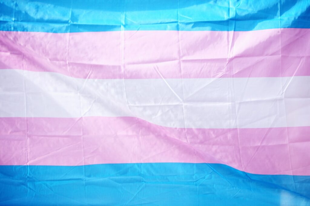
One preset, labeled WP_Variant_Pride_07 in the code, uses a soft gradient from deep pink to white to dark purple—colors aligned with the trans flag, though Apple doesn’t label them as such. That discretion is deliberate. The company avoids explicit flag representation in its default sets, likely to maintain global compliance. But the visual language is unmistakable to those who recognize it.
The Quiet Power of Pride-Themed Wallpapers
Apple’s commitment to Pride-themed wallpapers may seem like a small gesture, but it speaks volumes about the company’s values and commitment to inclusivity. By incorporating these visuals directly into the system, Apple sends a powerful message about its commitment to creating a welcoming environment for all users.
This approach also has implications for the broader tech industry. As companies continue to grapple with issues of diversity, equity, and inclusion, Apple’s approach serves as a model for how companies can balance their brand values with the complexities of global compliance.
And for users, Apple’s Pride-themed wallpapers offer a quiet but meaningful way to show support for the LGBTQ+ community. By making it easy and accessible for users to personalize their devices with Pride visuals, Apple creates a sense of inclusivity and belonging that extends beyond the surface level.
The Future of Pride-Themed Wallpapers
As Apple continues to evolve its approach to Pride-themed wallpapers, it’s likely that we’ll see even more sophisticated and nuanced designs. The company may explore new color palettes, textures, and patterns that reflect the diversity of the LGBTQ+ community.
We may also see Apple expand its customization options, allowing users to create even more personalized and unique Pride-themed wallpapers. The possibilities are endless, and it will be exciting to see how Apple continues to innovate and push the boundaries of Pride-themed design.
The Bigger Picture: Why This Matters Now
The significance of Apple’s Pride-themed wallpapers extends beyond aesthetics. It represents a broader commitment to inclusivity and diversity in the tech industry. As companies continue to grapple with issues of diversity, equity, and inclusion, Apple’s approach serves as a model for how companies can balance their brand values with the complexities of global compliance.
By incorporating Pride visuals directly into the system, Apple demonstrates a commitment to creating a more inclusive and welcoming environment for all users. This approach has implications for developers, founders, and users alike, and serves as a reminder of the power of design to shape our experiences and interactions.
Sources: 9to5Mac, MacRumors