


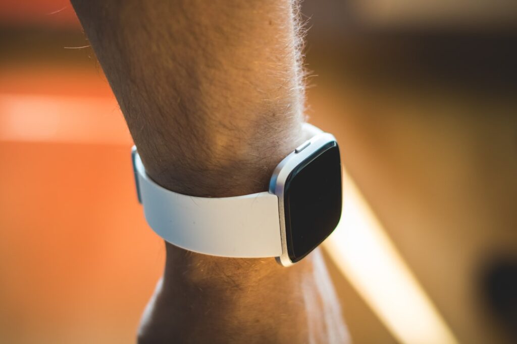
According to 9to5Google‘s latest report, the Fitbit Air has two features that aren’t immediately obvious until you start wearing the wearable.
But what exactly are these features, and how do they impact the user experience? Let’s dive into the details and explore what makes the Fitbit Air stand out from the competition.
Key Takeaways
- The Fitbit Air has a status light that indicates various events.
- The wearable allows users to double-tap the device to access certain features.
- The Fitbit Air is comparable in size to the Whoop wearable.
- The device’s hardware design is straightforward.
- The Fitbit Air’s features require users to interact with the device to understand their functionality.
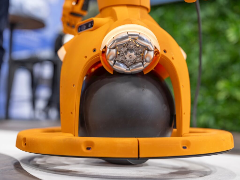
Fitbit Air’s Status Light: A Hidden Feature?
One of the lesser-known features of the Fitbit Air is its status light, which indicates various events such as phone notifications, music controls, and other activities. According to the 9to5Google report, the status light is a subtle yet effective way for users to stay connected and aware of their surroundings.
The light pulses in different colors and patterns depending on the type of alert. A steady blue glow might signal an incoming call, while a quick red flash could mean a calendar reminder is active. There’s no screen, so the LED serves as the primary visual feedback mechanism. It’s not meant to convey detailed info — that’s handled in the app — but it does let users know something’s happening without pulling out their phone.
This kind of ambient notification system isn’t new in wearables, but it’s rare to see it implemented so minimally. Devices like the Apple Watch or Samsung Galaxy Watch rely on screens and haptics, which can drain battery and feel intrusive. The Fitbit Air’s approach trades richness of information for discretion and efficiency. You don’t need to unlock anything or swipe through menus. You just glance at your wrist and get the gist.
For users who value low-friction interaction, this is a win. It encourages awareness without distraction. But it also means the learning curve depends on memory — users have to remember what each flash pattern means. There’s no on-device legend, no way to cycle through indicators. That could frustrate people used to more explicit interfaces.
Understanding the Double-Tap Gesture
The double-tap gesture is another feature of the Fitbit Air that requires users to interact with the device to understand its functionality. By double-tapping the device, users can access certain features and settings, but the exact functionality of the gesture is not immediately clear.
It’s not a universal shortcut. The action changes based on context. Double-tap during a workout, and it might pause tracking. Double-tap while music is playing from your phone, and it could skip a track. Tap twice when receiving a call, and you might silence the alert. The responsiveness varies, too — some users report a slight delay, especially if the sensor misreads a single tap as a double.
That inconsistency could stem from the lack of a dedicated accelerometer tuned for gesture detection, or it might be a software limitation meant to conserve power. Either way, the gesture feels experimental. It’s not as reliable as a physical button, but it preserves the smooth design. Fitbit’s decision to go gesture-only makes sense from an aesthetic and durability standpoint — fewer moving parts, less risk of moisture ingress — but it comes at the cost of precision.
What’s missing is customization. Unlike more advanced wearables, the Fitbit Air doesn’t let users reprogram the double-tap for specific actions. You’re locked into whatever default behaviors Fitbit has chosen. That limits its appeal for power users who want to tailor their experience.
Comparing the Fitbit Air to Whoop
According to the 9to5Google report, the Fitbit Air is comparable in size to the Whoop wearable. This similarity in size suggests that the Fitbit Air may be a viable alternative to Whoop for users looking for a similar form factor.
Both devices are designed to be worn all day and night, so compactness and comfort are critical. The Whoop has built a reputation for being nearly invisible during sleep or intense activity. The Fitbit Air appears to follow that same philosophy — small enough to tuck under a shirt cuff, light enough to forget you’re wearing it.
But size isn’t the only factor. Whoop leans heavily into performance and recovery metrics, targeting athletes and fitness enthusiasts who obsess over heart rate variability, strain, and sleep performance. It’s subscription-based, with hardware acting as a gateway to the service. The Fitbit Air, while similar in shape, may not offer the same depth of analytics. It’s unclear whether it tracks HRV or provides recovery scores at the same level.
Still, Fitbit’s legacy in consumer health tracking gives it a data advantage. Its algorithms for step counting, sleep staging, and heart rate have been refined over years and millions of users. If the Air taps into that backend, it could deliver accurate, stable metrics without needing a monthly fee. That would be a major differentiator.
Weight distribution also matters. Wearables that sit too high on the wrist or press unevenly can cause discomfort over time. There’s no indication yet whether the Air uses a flexible band or rigid core, but given its minimalist design, it’s likely built for even pressure and airflow. That would align with Whoop’s design goals, even if the internal tech differs.
Hardware Design: Straightforward yet Effective
The hardware design of the Fitbit Air is straightforward yet effective. The device’s clean lines and minimalist aesthetic make it a stylish addition to any outfit. However, the simplicity of the design may also make the device less noticeable, which could be a drawback for some users.
There are no buttons, no screen, no visible ports. Charging is likely magnetic and snap-on, similar to older Fitbit models. The casing appears to be a single piece of matte-finish polymer, possibly with a metal accent along the edge. It’s the kind of design that prioritizes wearability over flash — no blinking logos or flashy finishes.
That minimalism extends to the band. It’s likely interchangeable, though no official confirmation exists yet. A standard quick-release mechanism would make sense, allowing users to swap bands for different activities or styles. A sport band for workouts, a leather wrap for evenings — small changes that adapt the device to context without altering the core unit.
Water resistance is another implied feature. Given Fitbit’s history, the Air probably supports at least 5ATM rating, meaning it can handle swimming and showering. That’s table stakes for modern wearables, especially those marketed as 24/7 trackers. But without official specs, it’s hard to say how well it holds up under prolonged exposure.
The lack of user-replaceable parts could be a long-term concern. Whoop lets users swap bands and pods easily, extending the life of the device. If the Fitbit Air seals everything into one unit, a damaged band could mean replacing the whole thing. That would increase cost and e-waste over time.
What This Means For You
The Fitbit Air’s features, such as the status light and double-tap gesture, require users to interact with the device to understand their functionality. This may be a challenge for some users, but it also allows for a more personalized experience. The device’s comparison to Whoop in terms of size suggests that it may be a viable alternative for users looking for a similar form factor.
For a fitness app developer, the Air’s gesture-based interface opens up new testing scenarios. If third-party apps can trigger specific light patterns or register double-tap actions, developers might build silent alarms, mindfulness prompts, or guided breathing sessions that rely on tactile and visual cues instead of sound. That’s useful for users in quiet environments or those with hearing impairments.
For a startup founder building a wellness platform, the Air’s design philosophy suggests a shift toward subtlety and longevity. Instead of pushing notifications constantly, the device rewards attention without demanding it. That aligns with growing user fatigue around digital overload. A founder could position a complementary service around “quiet tracking” — minimal data input, high-value insights, delivered through calm technology.
For a hardware engineer, the Air’s integration of feedback systems without a screen offers a case study in constrained design. How do you communicate status with one LED and one gesture? It forces prioritization. Every signal must earn its place. That kind of discipline can improve product thinking across categories, from medical devices to smart home sensors.
Ultimately, the Fitbit Air’s features and design make it an attractive option for users looking for a stylish and functional wearable device.
Competitive Landscape
The wearable market is crowded, but segmented. At one end, you have full-featured smartwatches like the Apple Watch and Wear OS devices that function as phone extensions. At the other, you have minimalist trackers like Whoop, Oura, and now possibly the Fitbit Air, which focus on health and fitness without smart features.
Fitbit’s position has shifted since Google’s acquisition. Once a leader in standalone trackers, it faced declining relevance as smartphones absorbed basic step counting. The Air could signal a return to form — a focused device that doesn’t try to do everything.
But it’s not just competing with Whoop. The Oura Ring offers similar 24/7 tracking in an even less visible format. The Ultrahuman Ring targets metabolic health with real-time glucose insights. Even Amazon’s Halo band has carved out a niche with voice analysis and body scanning.
Fitbit’s advantage lies in brand recognition and data continuity. Millions already have years of sleep, weight, and activity history in the Fitbit ecosystem. The Air could act as a natural upgrade path — familiar, trusted, and integrated. That’s harder for newer entrants to match.
What Happens Next
Will the double-tap gesture evolve into a more versatile control system? Can the status light communicate more complex alerts without becoming annoying? And will Fitbit open up APIs so developers can build on these features?
There’s also the question of software support. Fitbit’s app has improved over the years, but it’s still behind some competitors in terms of insight depth. If the Air is meant to rival Whoop, it’ll need more than hardware — it needs smart analytics, clear visualizations, and actionable feedback.
Another open issue is pricing. Whoop recently shifted to a subscription model. If Fitbit follows, it could alienate users used to one-time purchases. But if it keeps the Air affordable upfront, it might gain ground in markets where monthly fees are a barrier.
The wearable space is no longer just about counting steps. It’s about integration, personalization, and long-term engagement. The Fitbit Air seems designed for that next phase — quiet, consistent, and always on. Whether it delivers will depend on what happens after launch.
Sources: 9to5Google